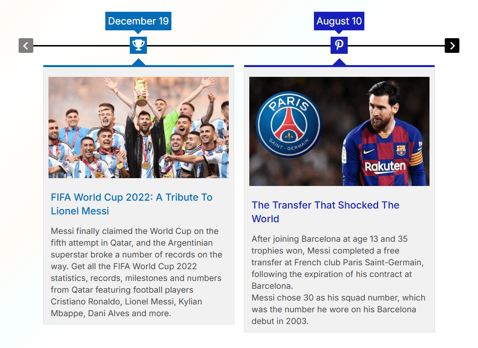
A horizontal timeline displays your stories or events in a left-to-right direction instead of the traditional top-to-bottom format. Cool Timeline allows you to display a horizontal timeline anywhere on your WordPress website using a simple shortcode.
You can add this shortcode inside your pages or posts using either the Classic Editor or the Gutenberg Block Editor.
Add Horizontal Timeline in Classic Editor
If you are using the Classic Editor, follow these steps to add a horizontal timeline:
- Open your page/post in Classic Editor.
- Click on the Add Timeline button in the toolbar (as shown in the editor screenshot).
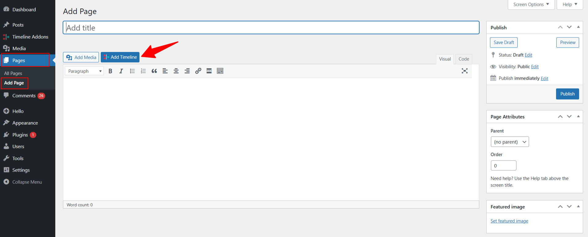
- A pop-up panel will appear.
From Layout Settings:
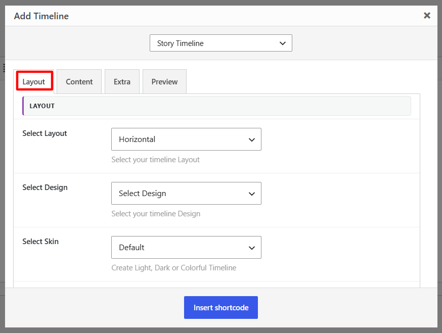
- Select Layout: Choose a Horizontal layout for your timeline story.
- Select Design: Select from multiple predefined timeline designs to change the visual appearance of your timeline.
- Select Skin: Set the color scheme of your timeline. You can choose Light or Dark styles depending on your site design.
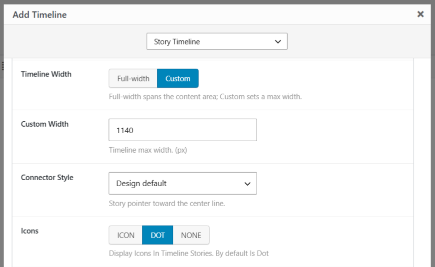
- Timeline Width: Choose how much space the timeline should use within the content area.Custom Width: Set the maximum width of the timeline when Custom width is selected.
- Connector Style: Choose how the story pointers connect to the timeline line.
- Icons: Choose icon for your timeline story from: Icon, Dot or None.
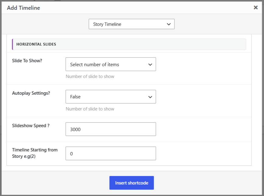
- Slide to Show: Set the number of stories (slides) visible at one time in your horizontal timeline.
- Autoplay Settings: Turn autoplay on or off for your horizontal timeline. When enabled, the timeline will automatically slide through stories one by one without user interaction.
- Slideshow Speed: Set how fast the stories should move in autoplay mode.
- Timeline Starting from Story: Decide which story the timeline should start displaying from. For example, if you enter “2,” the timeline will begin from the second story instead of the first.
From Content Settings:
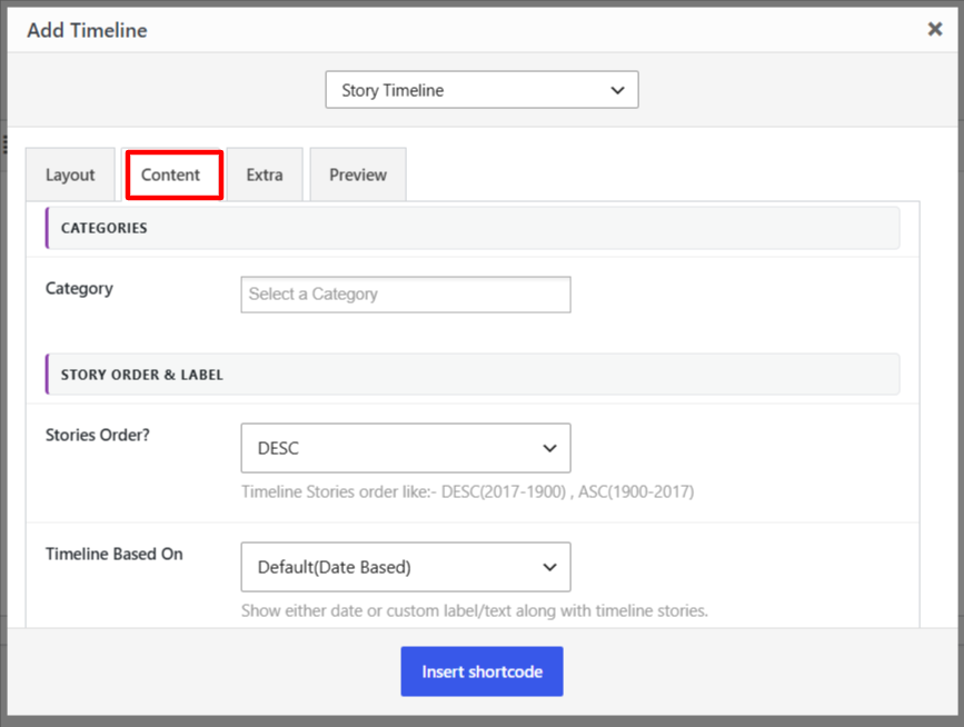
- Categories: Display all timeline stories or choose to display stories from a specific category.
- Stories Order: Choose how your stories appear on the timeline from ASEC or DESC.
- Timeline Based On: Decide whether your timeline should be Date Based (stories shown by date) or use Custom Labels/Text.
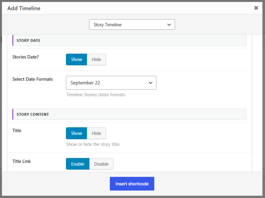
- Stories Date: Choose whether to show or hide the date for each story.
- Select Date Formats: Select how the date should appear on your timeline.
- Title: Choose to show or hide the story title.
- Title Link: Enable or disable the link on the story title.
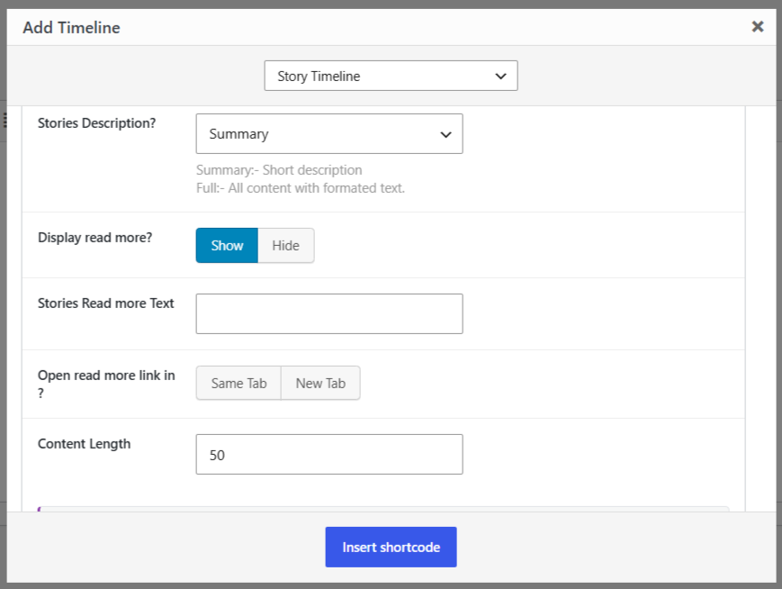
- Stories Description: Choose between Summary (short description) or Full (complete story content with formatting) for displaying story content.Content Type: Choose how much story content to display: Short, Full, or Hide.
- Display Read More: Show or hide a link to the full story.
- Stories Read More Text: Enter a custom text for the Read More link.
- Open Read More Link In: Choose whether to open the read more link in the Same Tab or a New Tab.
- Content Length: Set how much of each story’s text will appear before the “Read More” link.
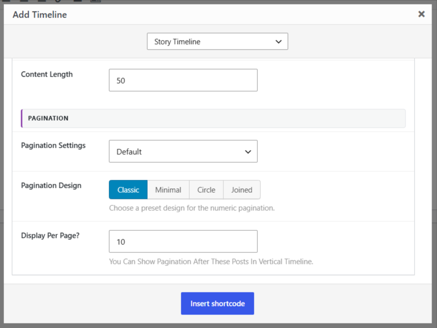
- Pagination Settings: Choose how users navigate between multiple pages of stories. You can use the default numbered pagination or enable AJAX “Load More”.
- Pagination Design: Choose a preset design for the pagination controls.
- Display Per Page: Set the number of stories displayed on each page.
From Extra Settings:
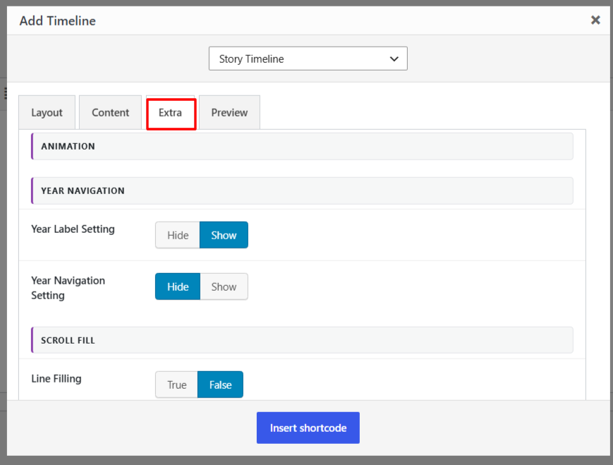
- Year Label Setting: Show or hide the year label display within your timeline.
- Year Navigation Setting: Show or hide the year navigation bar, allowing users to quickly jump between different years in your timeline.
- Position: Choose where the year navigation menu appears.
- Style: Choose the visual style for the year navigation menu.
- Line Filling: Toggle this on if you want to fill the center line connecting all stories.
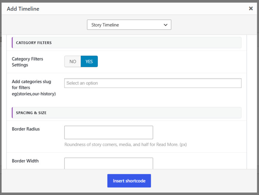
- Category Filters Settings: Enable or disable category-based filtering for the timeline.
- Add Categories Slug for Filters: Select or enter the category slugs you want to use for filtering timeline stories.
- Border Radius: Set the corner roundness of the story content, media, and Read More elements.
- Border Width: Set the thickness of the story border. The timeline connector uses the same border width.
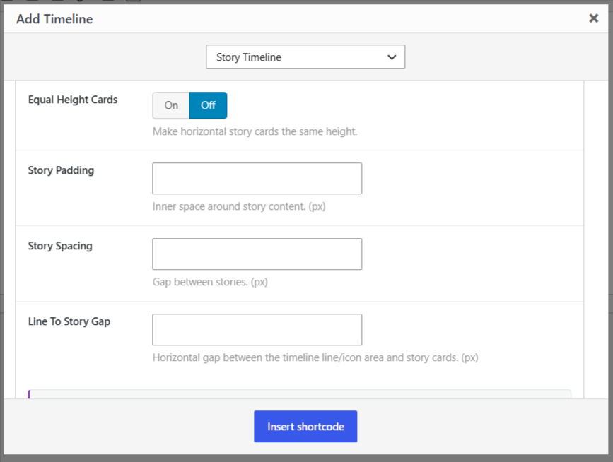
- Equal Height Cards: Set all horizontal story cards to the same height by turning option ON or OFF.
- Story Padding: Set the inner spacing around the story content.
- Story Spacing: Set the space between individual timeline stories.
- Line To Story Gap: Set the horizontal space between the timeline line or icon area and the story cards.
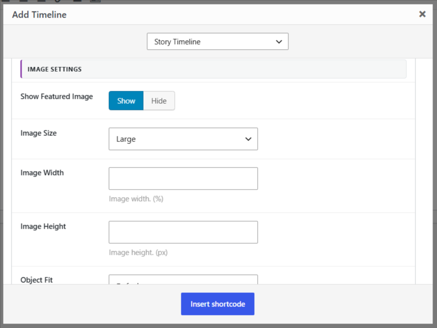
- Show Featured Image: Choose whether to display the featured image with each story.
- Image Size: Choose the WordPress image size to use for the featured images, such as Large.
- Image Width: Set the width of the featured image as a percentage of its available space.
- Image Height: Set the height of the featured image.
- Object Fit: Choose how the featured image fits within its image container.
- After being satisfied with all the changes, click on Insert Shortcode.
- Shortcode will be added to your page. Now publish your page and preview it.
If you want to explore more options to customize your Classic Editor timeline further, check out our Cool Timeline Settings Guide.
Add Horizontal Timeline in Gutenberg Editor
If you are using the Gutenberg Editor, follow these steps to add a horizontal timeline in block editor:
- Open any page or post in the Gutenberg editor.
- Click on the “+” Add Block button.
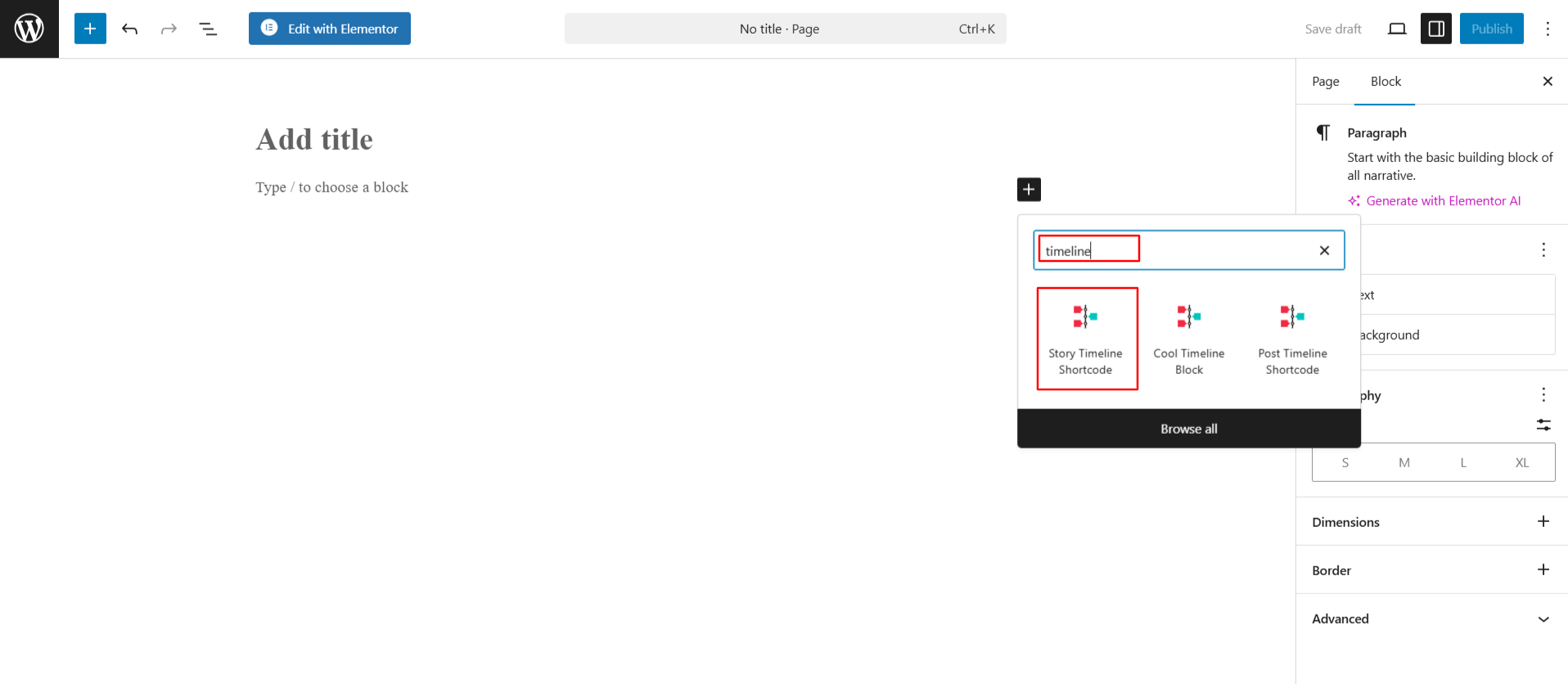
- Search for “Timeline” and select the Story Timeline Shortcode.
- The shortcode will be added to your page.
- After adding the timeline shortcode to your page, you can fully customize the display of timeline using the following settings.
Layout Settings
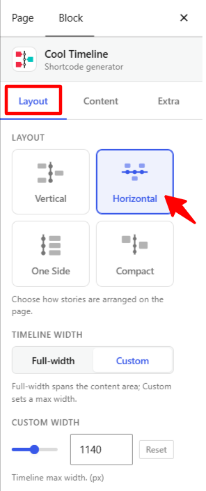
- Layout: Choose a horizontal layout from the available options.
- Timeline Width: Choose how much space the timeline should use within the content area.
- Custom Width: Set the maximum width of the timeline when Custom width is selected.
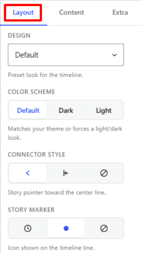
- Design: Select from multiple predefined timeline designs to change the visual appearance of your timeline.
- Color Scheme: Choose the color theme for your timeline. You can use the default, dark, or light skin according to your requirements.
- Connector Style: Choose how the story pointers connect to the timeline line.
- Story Marker: Choose the marker displayed on the timeline line for each story.
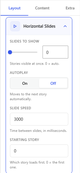
- Slide to Show: Set the number of stories (slides) visible at one time in your horizontal timeline.
- Autoplay: Turn autoplay on or off for your horizontal timeline. When enabled, the timeline will automatically slide through stories one by one without user interaction.
- Slide Speed: Set how fast the stories should move in autoplay mode.
- Starting Story: Decide which story the timeline should start displaying from. For example, if you enter “2,” the timeline will begin from the second story instead of the first.
Content Settings
- Categories: Display all timeline stories or choose to display stories from a specific category.
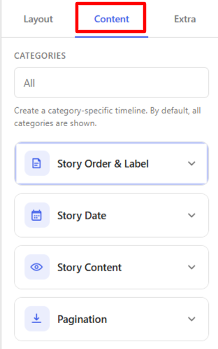
Story Order & Label
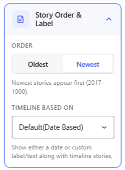
- Order: Choose how your stories appear on the timeline from Oldest or Newest.
- Timeline Based On: Decide whether your timeline should be Date Based (stories shown by date) or use Custom Labels/Text.
Story Date
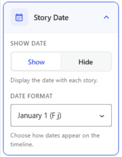
- Show Date: Choose whether to show or hide the date for each story.
- Date Format: Select how the date should appear on your timeline.
Story Content
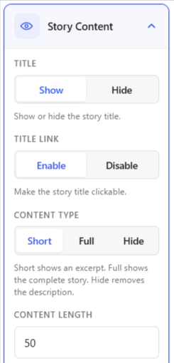
- Title: Choose to show or hide the story title.
- Title Link: Enable or disable the link on the story title.
- Content Type: Choose how much story content to display: Short, Full, or Hide.
- Content Length: Set how much of each story’s text will appear before the “Read More” link.
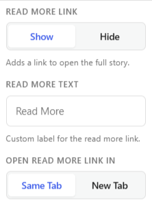
- Read More Link: Show or hide a link to the full story.
- Read More Text: Enter a custom text for the Read More link.
- Open Read More Link In: Choose whether to open the read more link in the Same Tab or a New Tab.
Pagination
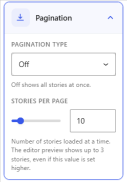
- Pagination Type: Choose how users navigate between multiple pages of stories. You can use the default numbered pagination or enable AJAX “Load More”.
- Stories Per Page: Set the number of stories displayed on each page.
Extra Settings
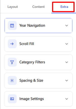
Year Navigation
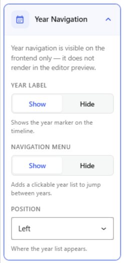
- Year Label: Show or hide the year label display within your timeline.
- Navigation Menu: Show or hide the year navigation bar, allowing users to quickly jump between different years in your timeline.
- Position: Choose where the year navigation menu appears.
Scroll Fill
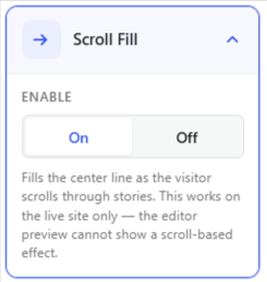
- Toggle this on if you want to fill the center line connecting all stories.
Category Filters
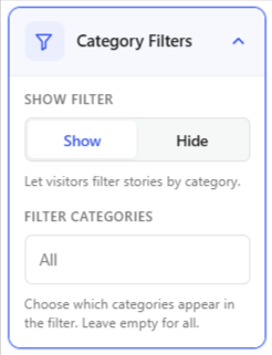
- Show Filter: Choose whether to show or hide filters to let visitors filter stories from specific categories.
- Filter Categories: Display all timeline stories or choose to display stories from a specific category.
Spacing & Size
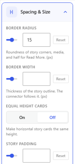
- Border Radius: Set the corner roundness of the story content, media, and Read More elements.
- Border Width: Set the thickness of the story border. The timeline connector uses the same border width.
- Equal Height Cards: Set all horizontal story cards to the same height by turning option ON or OFF.
- Story Padding: Set the inner spacing around the story content.
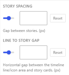
- Story Spacing: Set the space between individual timeline stories.
- Line to Gap Story: Set the horizontal space between the timeline line or icon area and the story cards.
Image Settings
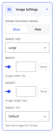
- Show Featured Image: Choose whether to display the featured image with each story.
- Image Size: Choose the WordPress image size to use for the featured images, such as Large.
- Image Width: Set the width of the featured image as a percentage of its available space.
- Image Height: Set the height of the featured image.
- Object Fit: Choose how the featured image fits within its image container.
- After being satisfied, publish your page and preview it
Output